By Trampoline Design & Marketing Co.
Paradox Brewery, an independent, veteran-owned craft brewery, specializes in brewing innovative beer out of its state-of-the-art facility in the mountains of the Adirondacks. Utilizing the naturally-filtered water flowing through the granite below the brewery, the beers are clean, crisp, smooth, and, no matter your preferred style, highly drinkable and balanced.
The team of brewers puts a modern twist on their beers (and seltzers), infusing passion and quality into each product with eye-catching branding and playful specialty releases. At Paradox Brewery, the beers are brewed for the most distinguished of palates—mountain bikers, skiers, hikers, weekend warriors, adventurers, young parents, grandparents, and everyone in between.
From the mountains to the city, Paradox is brewing high-quality beer that can keep up.
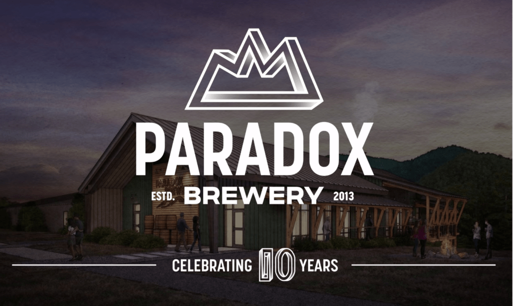
As the brewery geared up to celebrate its 10th anniversary, the team wanted a new look to welcome the next chapter. The goal was to part with the ADK aesthetic and introduce a more universal look for national distribution and beyond.
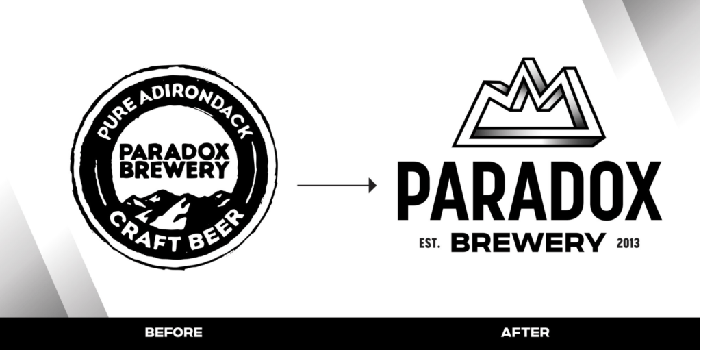
The previous Paradox mark and message were often confused with other brewers in the region, and their draft and package sales were impacted—leaving them with a need to stand out on crowded shelves in an entirely new way. The existing brand identity, built around the NYSDEC brown-and-yellow signage color palette, resonated with locals but failed to connect with consumers in the downstate and Mid-Atlantic markets.
After investing in a new brewery and tasting room, it was time to try a fresh approach to marketing: a strategy to create demand and present the product with an updated shelf presence, brand language, and design overhaul.
“Our vibe needed to change a little bit. Now that the market is getting a little tougher, we really put a lot of thought into what customers we want to target and need to target for the longevity of the brewery…Some of the things that aren’t changing are the way we produce beer.”
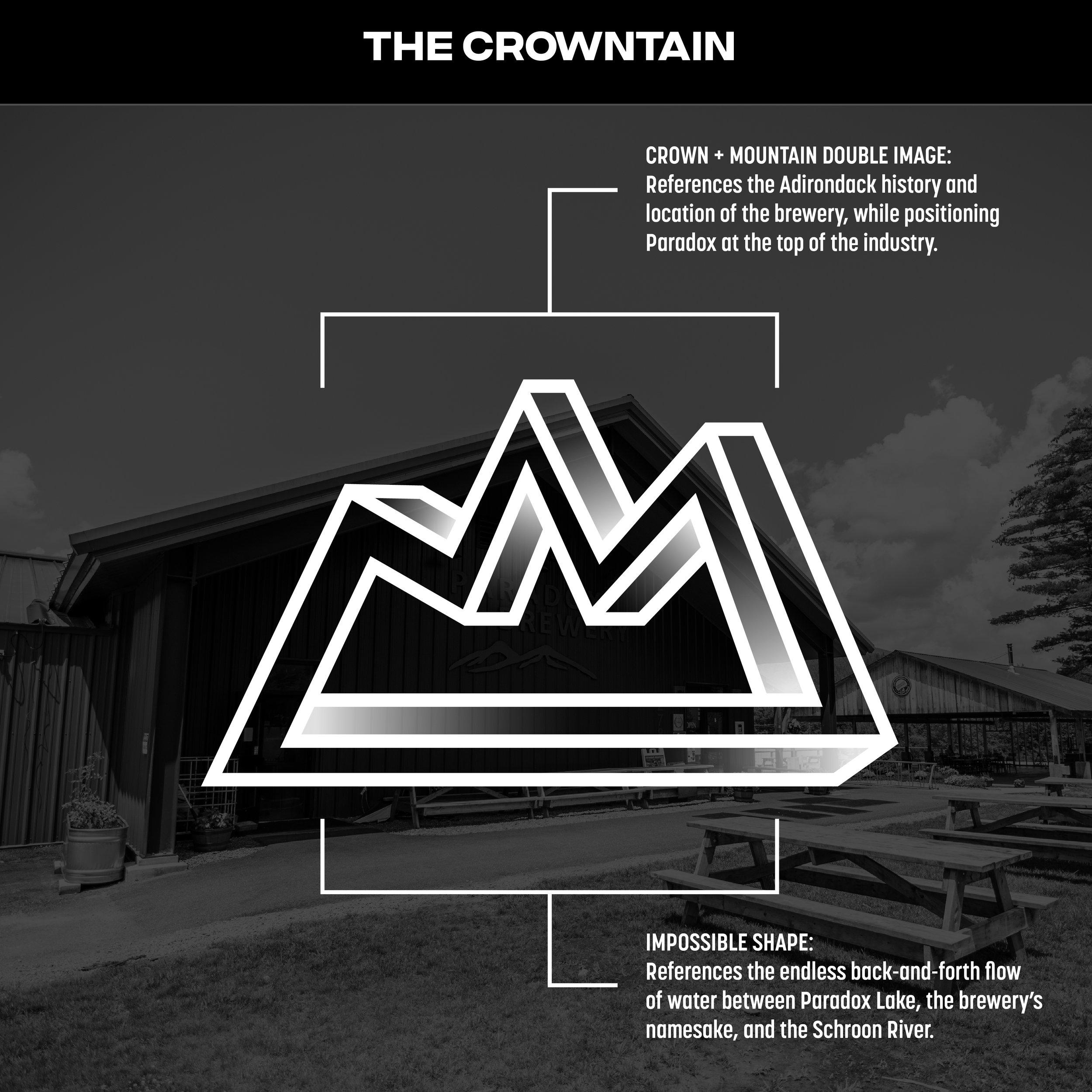
The Crowntain
In response, our design team created the “crowntain,” a nod to the mountains and the history of place, but with a modern spin—the crown as a sign of quality ingredients and incredible beer. The “impossible shape” references namesake Paradox Lake and its endless back-and-forth flow with nearby Schroon River.
While a departure from the trail marker logo that put them on the map, Paradox’s new brand upholds its roots and preps it for new adventures. As the saying goes, “in a time of rapid change, standing still is the most dangerous course of action.” Paradox is forging ahead with a bold new look sure to win over even the toughest internet critics. See more on that below…